Brand Identity
Zakat Mal — Brand Guidelines
A reference for designers and developers on how to use the Zakat Mal visual identity correctly and consistently across all surfaces.
Logo
The primary mark combines an 8-pointed geometric star — rooted in Islamic geometric art — with a clean Inter wordmark. The gold centre dot represents the act of giving.
Primary — light background
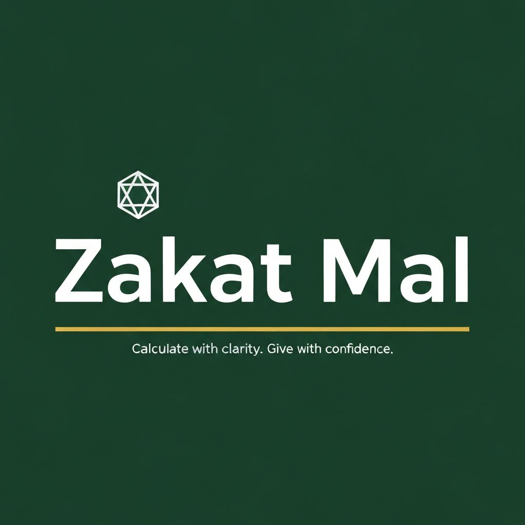
Reversed — coloured background
Icon mark — multiple sizes
Favicon / App Icon
Colour Palette
The palette uses exactly 5 colours — never exceed this set without explicit approval.
Forest Green
#1a6b45
Primary / Brand
Warm Parchment
#f6f3ee
Background
Sand
#ede9e1
Surface / Secondary
Gold
#b8923a
Accent
Charcoal
#1a1a1a
Foreground / Text
Typography
One typeface family — Inter — across all weights. Never use a second typeface.
Display
Zakat Mal
Heading 1
Your Zakat, simplified
Heading 2
Annual Zakat Summary
Body
Track your assets, calculate your obligation, and record your payments with full confidence.
Caption
Last updated 3 March 2026 · 10-day free trial
Label
Nisab Threshold
Iconography
24px outlined stroke icons at 1.5px weight. Always use brand colours — never standalone black.
Savings
Zakat
Reports
Security
Calendar
Payments
Logo Usage Rules
Follow these guidelines to ensure the mark is always represented faithfully.
Use the green-on-light version for light backgrounds
Use the white-on-green version for dark or coloured backgrounds
Maintain clear space equal to the icon width on all sides
Scale proportionally — never stretch or distort
Never place the logo on busy photographic backgrounds
Never change the brand colours to anything outside the palette
Never rotate or apply effects to the logo
Never use the wordmark without the icon mark
Social Share Image
Used for Open Graph previews when the site is shared on social platforms. 1200×630px.